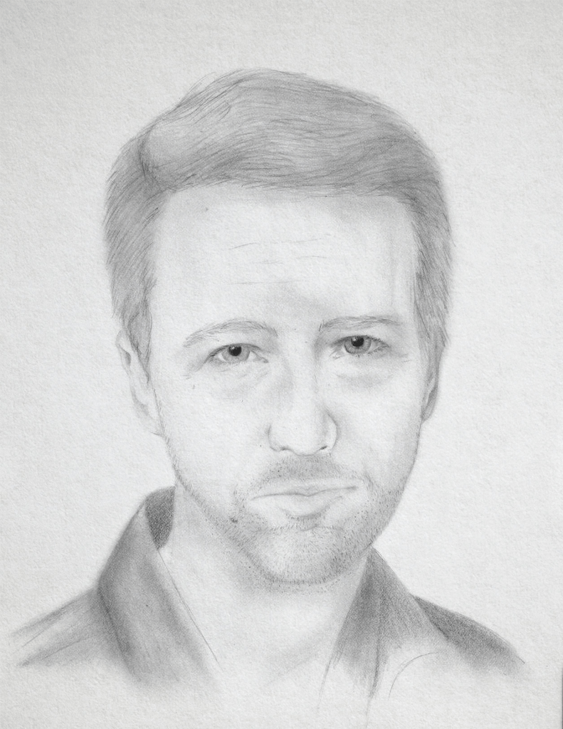
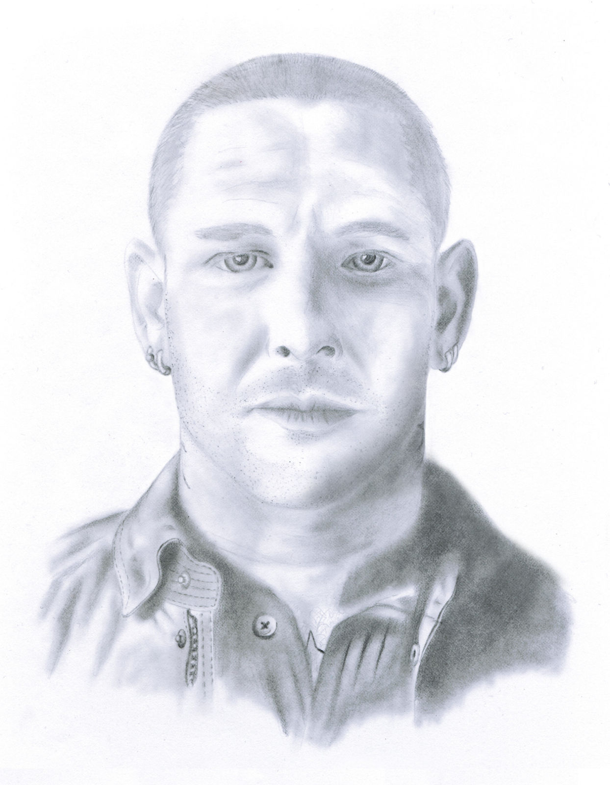
Edward Norton

Number four in my “People Who Kick Ass” series, Ed Norton is a talented actor and was really impressed by his versatility when he did “American History X”, “Fight Club” and “Keeping the Faith” in succession. The trickiest part about this was the 5 o’ clock shadow – I had to not make it look like I just shaded in an area and not make the stubble to pronounced so as to end up giving him a beard.

Tiger

The purpose of this was to educate myself on how to draw animals and specifically, get colored fur to look like it has texture. The Prismacolor Premier pencils I used have a soft lead and don’t hold a sharp point very well so I used those when I needed to lay color down and went back over top with Prismacolor Veritihin pencils to give the colored areas texture.

Bill Nye

Bill Nye The Science Guy! Watching old episodes of Bill Nye is something my son and I enjoy and so I drew this for him as part of my “People Who Kick Ass” series. Same as my other portraits, this was done on vellum with a reference photo but I went heavier on the shading than I normally do.

Agent 47 Self Portrait

One of my favorite game series is “Hitman” and I really like the movie based on the games as well. This was just a fun one done on a whim one night when I was bored. I took a picture of myself posed in this position to get the proportions right and dressed myself in the suit and added the weapons.

To Fly

My first foray into oil painting, I did this for my son. Initially, this was just supposed to be a learning experience in figuring out how to blend colors and create gradients. The brush I used for the character in the middle is similar to the kind of brush used in Japanese calligraphy and trying to get each stroke right on the first shot was a challenge in its own right.

Corey Taylor

Corey Taylor is another musician who I really admire and is a brilliant artist. Trying to keep the shadowing consistent on the left side of his face and jacket was a challenge and since his shirt and coat are black, I didn’t want to make it too dark overall to take away from his face.

Ireland Grunge

This was requested after seeing my other flags. The font brought it together. I used a free font without license restrictions. The colors used are the exact color codes for Ireland’s flag. The map was easier to manipulate since I managed to find one where there was nothing other than Ireland in it.

Deutschland Grunge

Like my “Italia Grunge” flag I created, this was done in a similar fashion. I layered high res images to created the rough and work background then found a high resolution map of Germany edited to eliminate irrelevant content. The finished product was printed on canvas at full scale which is 2 by 3 feet.

Mama’s Ink

“Old school biker tattoo” was my theme for this. I had a tattoo I wanted to get covered on my shoulder and I thought this was a fitting piece since I’m a self-admitted mama’s boy. The paper I used had quite a bit of tooth so the soft graphite sank into the paper and the dark areas are where the really soft leads were used to get a thick covering.

Stylized “F”

My intention for this was to be the back of a very old business card I was designing for myself. Ultimately, I scrapped the business card design and ended up using this a desktop background. I took high-res images of several different textures and changed the blending options on the layers to get the old and work look.